George Bickhams Penmanship Made Easy Young Clerks Assistant
 Last week I shared some 18th century letter-writing advice aimed at ladies which told me that I needed to "learn to write a fluent and ready hand." I've been practicing English Round-hand from copy-books like George Bickham's The Young Clerk's Assistant, but that "large copy-hand" is less useful for familiar letters. So what model should I follow to write more fluently? I looked to George Bickham, 18th century penman and engraver, and he came through for me again.
Bickham's most famous work, The Universal Penman, includes not only many spectacular examples of the penman's art, but also a plate of "Specimens of the Running Hand," a more flexible, fluid handwriting style that is closely related to Roundhand. The Universal Penman isn't available in its entirety online, but a fine paperback reprint is available from Dover (Google Books Preview). The plate I'm working from is numbered 163 in the Dover edition, and was first published in 1739. Let's look at how this hand runs!

First, my rendition of the lower case letters. Note how many variations Bickham includes! If you look at his models for Roundhand, just a few letters there have variable forms. In the running hand, most of the letters have options. This suggests to me that even though Bickham has made a copy-book plate of this running hand, it's a more dynamic, less rigid style than Roundhand. Different writers can choose different forms for different purposes. Just look at the three different forms of "r" in the second line!

Another feature I noticed while preparing this sample was how easily each letter flowed into the next. To get the precise turns and hairlines of Roundhand, I often lift my pen off the paper. The 'joins' between some of the Roundhand letters seem a little artificial, like I'm drawing in a connection that doesn't flow naturally from the writing. Running hand, however, prioritizes forward motion and more natural connections. The q, for example, stops dead in Roundhand, but runs ahead to the next letter in this style. The loops in the uprights (like the Ls and Bs in 'legible') similarly help the line flow rather than being constrained in sharp angled lines. And although Bickham's Running hand specimens still have a lovely contrast between thicker downstrokes and thin hairlines, the difference in width is much smaller than in Roundhand. That means a smaller cut of the nib and a lot less careful rolling of the nib when writing. Nonetheless, Running hand still feels like it belongs to the Roundhand family- the slant is the same, the heavy strokes and hair-strokes are in the same places.

Capital letters also show a lot more variation in Running hand. I enjoy how flamboyant some of them are, but most of them prioritize that sense of forward motion. Some of these different capital forms may have special uses in business, since Running hand was often used for writing statements of debt, credit, and other transactions of money. In fact, a 1799 copy-book I found recently refers to Running-hand as "Currency"! Where the Roundhand alphabets are followed by moral maxims for practice, the Running-hand plates have phrases like "Borrowed at 4 1/2 Per Cent from Mr. John Connor £512" and "Sold Joseph Champion 2701 Pounds Maryland Tobacco."

That copybook, titledThe Academical Instructor, is a bit of a puzzle. Although its author is proudly designated as "Duncan Smith of London" and all of the text is in English, the book was printed inNürnberg in Germany. The Google Books scan comes from the Bavarian State Library, and not a lot of other libraries seem to hold copies (according to WorldCat). This is unfortunate for many reasons, one of them being that the Google Books scan is of terrible quality. I was overjoyed to discover a new copy-book from right in the middle of my chosen time-period, but my joy diminished significantly when I saw how low-res this scan is.
George Bickham says that "a legible and free Running hand is indispensibly Necessary in all Manner of Business," but its fluid lines should also speed my letter-writing. All this business-talk did worry me a little – maybe Running hand isn't lady-like? So I turned back to The Polite Lady for reassurance. Her advice was to learn Round-hand first, as I have done, "for when you are a mistress of that, you may, with great ease, learn either a neat running, or Italian hand; but if you begin with the latter, you never can arrive at any degree of perfection in the former." A neat running hand it is!
If you've spent any time with 18th century literature as it was printed in the period, you've probably stumbled over the "long s" or ſ. In some typefaces, it looks so much like a lower case f that when I read it my mental voice sounds like it's lisping. One reason the long s can be puzzling is that there are two rules in effect during this period, one for handwriting and one for printing.
Long S in Print
In printed books during most of the 18th century, ſ appears at the beginning and middle of words, while the now-familiar 'short' or 'round' s only appears at the end of words. The Complete Letter-writer of 1778 expresses this rule slightly vaguely as:

The 1798 edition of The Polite Lady displays this use of long and short s, as you can see in the image below. The long s appears in the middle of words like "blush," "modesty," and "pleasing," and at the beginnings of words like "smile" and "so." The short s only appears at the end of words like "virtues" and "perhaps." The word "possessed" has two sets of double long s, but when the double s ends the word, like "confess", the first s is long and the last s is short.

But that edition of The Polite Lady was behind the times- the long s was already going out of fashion. Some London printers in the 1790s were already using new typefaces that lacked the long s, and by the early years of the 19th century it was disappearing rapidly.
Long S in Handwriting
However, handwriting from the 18th and early 19th century follows a slightly different rule, as do engraved plates that imitate master penman's writings (like those in George Bickham's Young Clerk's Assistant). In writing, the long s is only used as the first letter of a double s, at any point in the word. The following image is from George Bickham's Moral Maxims in Roundhand. Wherever there is a double s, it is composed of a long and a short s (happiness, blessing). Every other lower case s, whether at the beginning, middle, or end of the word, is a short s (choicest, modest, is, finds).

To see these rules in real handwriting, I turned to Jane Austen's fiction manuscripts, which are all viewable online in a "digital edition." Here's a short passage from Austen's 1813 "Plan of a novel, according to hints from various quarters," now in the Morgan Library.

This snippet reads "TheHeroine a faultleſs Character her self —, perfectly good, with much tenderneſs & sentiment, & not the leastWit-" Austen uses the short s at the beginning of "sentiment" and in the middle of "least," and only uses the long s in the double s of "faultless" and "tenderness." I find the written long s much less confusing and f-like than the printed version. And w hen I practice my English Roundhand writing, I relish a double s! It's very satisfying how the swooping loops of the long s resolve into the compact curl of the little s.
Learning these rules has helped me parse 18th century sources more easily, and I hope they will help you too. However, I still have to concentrate very hard to keep my mental voice from saying "f" when I see "ſ"!
Read More:
- The Wikipedia entry on Long S discusses briefly the whole history of long s, in both print and handwriting.
- For a much more exhaustive account of the uses of the long s in print, see this post on Babelstone.

I reached a benchmark of sorts in my English Roundhand practice the other day- I used up a whole pad of paper! I've been using a Rhodia graph paper pad, pulling out each perforated sheet to dry as I fill it up with wet, inky writing. That's 80 sheets of principal strokes, letters, minums, words, and model sentences. I've done a good deal of practice on other papers too, but still there was something especially satisfying about pulling off that last sheet of paper and adding it to the stack of completed pages.

I used the last 20 pages or so of this pad faster and faster as I worked on minums in earnest and then moved on to real actual words in sentences! In the Young Clerk's Assistant, George Bickham helpfully includes moral maxims starting with each letter of the alphabet for the learner to practice. There's also a page of sentences which manage to include every letter of the alphabet and a moral message- "The quick brown fox jumps over the lazy dog" just isn't high-minded enough for Bickham!

After I wrote out enough aphorisms to cover the whole alphabet, I felt very much like Mary Bennet in Pride and Prejudice. "Beauty's a fair but fading flower," I announced to my husband, "Indolence is an inlet to every vice." He answered in the best way possible: "You have delighted us long enough."
If I get bored of the moral maxims in Bickham's book, there are many alternatives. Other instructional books print alphabetical lists of "copies" for handwriting practice, even if they don't have Bickham's engraved plates to model how the writing should look. John Jenkins' 1813 Art of Writing has four pages full of "Exercises for Writing in Single Lines," so students have a choice of sentiments for each letter of the alphabet.The Young Man's Best Companion or Self Instructor provides two lofty sentiments for each letter, but also conveniently adds a selection of "Short lines for Text Hand," similarly righteous. The first of these, "Abandon whatsoever is ill," sounds like a first draft of the phrase Michael Hayes copied over and over in his borrowed book: Abandon every sin. Perhaps Michael's writing master had a book like one of these, full of alphabetical mottos.

I have a fresh new pad to fill with all these practice texts, and a sheaf of freshly cut quill pens. Someday soon I'll be ready to write my school piece!
 As I've been practicing English Round-hand, a Regency era handwriting style, I've worked on lower case letters, joining letters together, and Capital letters. Just lately I've been doing a handwriting exercise that lets me practice all those elements at once!
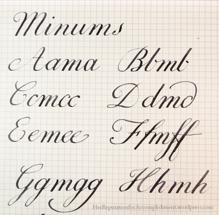
The exercise comes from a page of George Bickham's Young Clerk's Assistant titled "Minums in Round-hand and Italian." What is a minum? In this case, a minum appears to be a nonsense word that includes several forms of a letter, with m in the middle to practice spacing and joining. I haven't found a reference anywhere else to this kind of minum, but I imagine the word derives from the writing term "minim," which refers to the small basic stroke – a dotless i – that makes up the letters m, n, i, and u in many historical European hands.
In the plate from Bickham's book, shown below, each minum begins with a capital letter followed by the lower-case form of the same letter, then m and one or two additional lower-case letters. This series allows the learner to practice all the slightly different ways a letter might be formed when it falls at the beginning, middle, or end of a word. Take a look at the Round-hand minum for S: the first lower-case letter shows the word-initial form, while the double s at the end shows how the long s is used as well as the word-final form of the letter. Some letters, like d and g, have an extra swooping flourish when they come at the end of the word. Others, like e and p, just have a little additional curl.

Comparing this plate with the other Bickham plate I've been working with, titled "Learn Round-hand without a Master," some of the Capitals are formed quite differently. M and N on this plate are much more like the lower-case versions. It's another sign that the "Learn Round-hand" plate was inserted into the book at some point after original publication, and possibly engraved by a different person. The Young Clerk's Assistant seems to have been reprinted many times since its debut in the 1730s, and the 1787 edition digitised on Google Books has some differences from the 1733 edition reprinted by Dover Books. Variations in letter-forms seem to be the rule rather than the exception among the different writing masters, so I've been practicing lots of the different capital letter-forms found in my sources.
I was getting a little frustrated with my capital letters until I started practicing with minums. I like how they work a little more like actual words, so my hand feels the familiar slant and spacing of the lower case letters in between each capital. In most cases, capital letters need to work closely with the lower-case letters following them, so it makes sense to practice them together. Unlike real words, though, they're short and have no potentially distracting meaning. Doing each minum in order gives each letter a thorough "work-out," too.
Bickham's plate contrasts "Round-hand" with "Italian" handwriting. "Italian" hand is very similar to Round-hand, but is slightly more sloped (like Italic fonts), uses a narrower downstroke, and less contrast with thicks and thins. Throughout The Young Clerk's Assistant, Round-hand is associated with young men and Italian with women. There are two sets of moral maxims with heavily gendered content, one "for the Practice of Youth in the Round-hand" and the other 'For the Practice of the Ladies in the Italian Hand." While 'youth' are given the sentence "Fortune's a fair but fickle mistress," 'the ladies' are to copy out "Fame once lost can never be regained." I should probably follow Bickham's suggestion and learn the more lady-like Italian style one of these days, so I can express such high-minded sentiments in the most feminine hand! In the meantime, I'll stick to my nonsense words.
Lately, I've been practicing English Roundhand capitals with my quill pens. After a long time working with lower case letters, it's fun to let loose a little and swoosh around the page! John Jenkins, the American writing master, gives a whole new set of "principal strokes" for forming the capital letters, and you can see how much more room for swooping there is compared to the lower case strokes.
Like the lower case letters, Jenkins groups most of the capitals together by shape. For example, P, R, and B all begin with a downward "Body stroke" that curves gracefully back up to the top so that the pen is ready to form the head of each letter.

The system breaks down a bit, though, in trying to get all the capital letters onto two plates. Somehow O is missing entirely, and there are two versions of the letter V. One, at the bottom right of the image above, is just a lower case v enlarged, while the other is a pointy letter like N, M, and W.

Although I find all the curvy strokes really fun to play with, they also make it more difficult to get the letter forms just right. With so many compound curves and so few parallel angles, it's hard to get them all arranged proportionally. Most of the letters are designed to be made in just a few connected strokes, so one is expected to make all those complex curves without lifting the pen from the page! For a few of the letters I actually traced my models to get the feel for them in my hands and to see what they looked like on my paper. Getting the size of the flourishy curves at the beginning and ending of the letters right is a challenge, too- too small and they look cramped, but a little too big, and they draw attention away from the important strokes of the letter.

For comparison, the capitals from the 1787 edition of George Bickham's Young Clerk's Assistant have a few stylistic differences but are mostly similar. If Bickham were grouping letters though, he'd put P and R with D rather than with B. Interesting! I think I prefer these more droopy initial flourishes on letters like I and J- they don't run the risk of looking like the cross stroke of the T:

*Since I'm a huge fan of the 1995 Pride and Prejudice mini-series, whenever I look at the titles of John Jenkin's plates, all I can think of is Sir William Lucas:

The first Accomplishment I want to acquire is writing- an authentic regency writing hand. After all, The Polite Lady warns me "But it is not only an useful it is likewise a polite qualification;nor should any one pretend to the character of an accomplished woman who cannot write a distinct and legible hand."
The handwriting I've seen in Jane Austen's letters and manuscripts, as well as that of her contemporaries, is not always distinct or legible. But each letter usually slants exactly the same way, and there are enough commonalities among very different people that they must have been trained to follow similar models. How can I find those models? A book titledYoung Man's Best Companion and Guide to Useful Knowledge (There was a stiff competition for 'Best Companion', it seems, based on the number of books that use some variation of this title) tells me to carefully copy good examples of handwriting, and that:
In selecting examples for imitation, engraved specimens are to be preferred to written : for the engraver working deliberately and mechanically with his tools, and re touching the plate until his work be to his satisfaction, is able to produce letters, words, and lines, much more regular and uniform in shape and proportion than any which, unless the writer be singularly accomplished indeed, can be executed by the hand and pen.
This seems like good advice, but how am I going to find the right engraved specimens? What do I search for, since my period sources do't give me specific names? I had heard of "Copperplate" and "Spencerian" handwriting styles, but they belong to the later 19th century. To achieve their graceful thick-and-thin lines, calligraphers use flexible steel nibs that only replaced quill pens in the 1830s or so. I discovered that what is now calledEnglish Roundhand, an ancestor of Copperplate handwriting developed in the 17th century, was popular through the early 19th century. It also accords well with my sources, which often mention a "round" hand in contrast to "running" or "Italic" hands.
As for engraved specimens, George Bickham's name comes up again and again. In The Universal Penman, he collected fine examples from the best English writing masters and published them as engraved plates. More relevant to my needs is his slim volume The Young Clerk's Assistant; or Penmanship made easy, instructive, and Entertaining, first published in 1733. Google Books has a full text of a 1787 edition, It contains examples of round and other hands, and LOTS of "moral maxims" to practice copying. The title may sound rather masculine, but there are poems and epigrams specifically aimed at young ladies as well as young gentlemen.
Unfortunately, Google Books' scan is too washed out to be a good model- it doesn't capture the fine hairlines that are an essential part of the letter forms. I acquired Dover's reprint of the 1733 edition, only to find that it doesn't include my favorite plates titled "To learn round Hand without a Master", which had large letters both separately and joined. They instructs me to "Write each article on this and the following page forty times over in a Copy-Book ruled with double lines." Here they are from that washed out scan of the 1787 edition (Click to see a larger):


Since The Young Man's Best Companion told me to practice writing each character large and carefully, I felt I needed to look further for models. I found it in John Jenkins' Art of Writing , an American manual from 1813. The International Association of Master Penmen, Engrossers, and Teachers of Handwriting (IAMPETH) hosts high-quality scans of some hard to find writing manuals, and Jenkins' book is the earliest they have. The paper it's printed on is russet with age, but the hairlines stand out clearly! I de-colored and cleaned up a few of the plates that show the basic strokes and the small letters:


John Jenkins is a big believer in teaching through "dialogue," by which he means memorized questions and answers about the theory and practice of writing. I don't find that very helpful, but I do like his method of presenting the basic pen strokes that form all the letters. The hardest elements for me to get right are the slope of the letters and the delicate hairline curve at the top and bottom of many lines, and his basic strokes emphasize learning those skills. A close comparison of his letterforms with Bickham's shows that they are not identical, but they are definitely in the same family.
Jenkins also has the ladies in mind in his volume, as this elegant page shows:
To Write with ease & Elegance / is a most Useful, Polite and / Necessary Accomplishment / For all Young / Gentlemen and Ladies. / By diligence and care Your Writing will be fair
Source: https://herreputationforaccomplishment.wordpress.com/tag/george-bickham/
0 Response to "George Bickhams Penmanship Made Easy Young Clerks Assistant"
Post a Comment